 la
la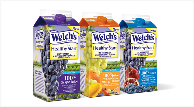 la
la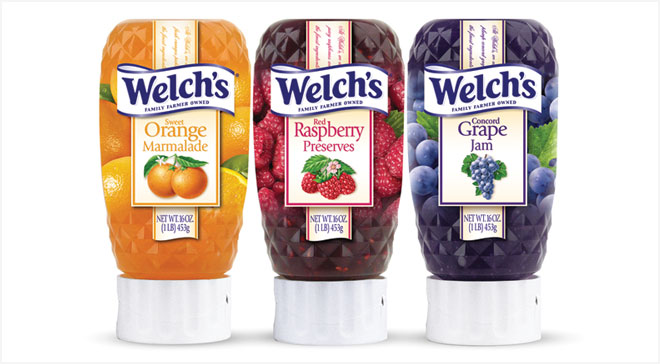 la
la la
la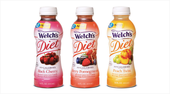 la
la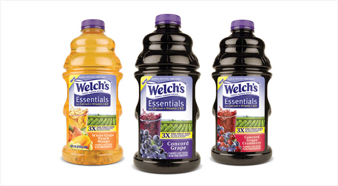 la
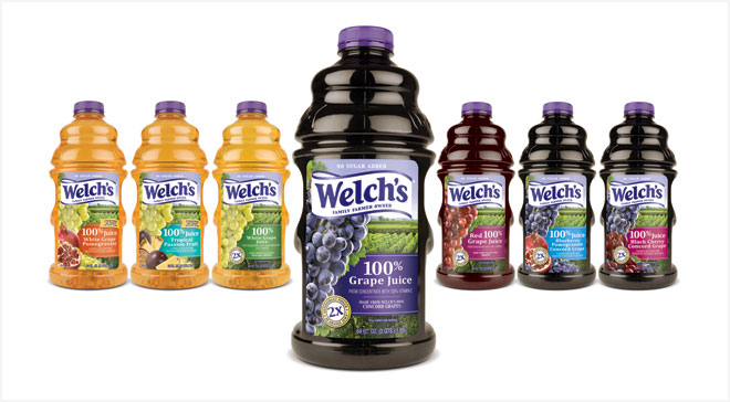
laConcerned about lapsed usage, Welch’s looked to Bailey for a brand refresh. We capitalized on the strong connection consumers have to Welch’s grapes by bringing the theme—Real grapes, grown by real people, for the way we really live—to life.
We developed the brand strategy, packaging and structures for the entire line of products. To visually reinforce the theme, we incorporated unaltered fruit and vineyard imagery with the Welch’s purple equity color and updated typography.
The results: Growth of sales in 2010 by 7%.
 DOWNLOAD CASE STUDY
Welch’s